Media queries breakpoints css tricks (media queries for standard devices)
@media CSS tricks / media queries CSS tricks introduction
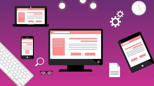
In the modern web, it is crucial to have a responsive site, and by “responsive,” this is the tailoring of the content of the sites to adapt to various screen sizes through CSS / Cascading Style Sheets. Media queries breakpoints CSS tricks help to create such responsive websites.
Presently, Google uses responsiveness of sites as one of the algorithms to rank websites. Consequently, it is very important to work on layouts of your sites on various devices.
Tip: Not everyone has access to all these devices (Ipads, Tablets, Iphones, Large Screens etc). In such cases, you can use online simulators like http://testsize.com to test your website for responsiveness.
Screen Orientation: Portrait / Landscape
@media queries can be used to change any layout element depending on the orientation of the browser. Most smartphones have an option to change the orientation of the screen, as such, we have to tailor our elements to instances of screen orientation changes.
In such cases, we use orientation @media queries.
Portrait Orientation
Normally, the screens, for example, phone screens are in portrait orientation (height is longer than width).
Example:
@media only screen and (orientation: portrait) {

}
Landscape Orientation
However, if you change orientation to landscape, the window becomes wider than the height.
Example:
@media only screen and (orientation: landscape) {

}
Screen Size: Min Width to Max Width
To target given screen sizes without the “overlapping,” we have to specify “boundaries” within which the target screens fall. This is done by the use of (max-width: …) and (min-width: …) which specify the minimum and maximum screen widths.
Example:
For a browser whose width falls between 500 and 1000 pixels, we can set the maximum and minimum widths as follows:
@media screen and ((min-width: 500px) and max-width: 1000px) {

}
Adding additional values / “OR Operator” option
What if we wanted to execute more than one condition (other than the “AND” condition)? We can introduce a second condition using the “OR” condition.
Using the example above:
@media screen and ((min-width: 500px) and max-width: 1000px) , (min-width: 1200px) {

}
By adding the comma “,” above, we add a second condition which simply means, if the width is between 500 and 1000px OR above 1200px, perform a given action.
Common media queries breakpoints CSS tricks for Desktops, Tablets, and Mobiles
You can copy the CSS codes below.
Laptops, Desktops and Large Screens
This is for a large screen / high-resolution desktop monitors, with a minimum resolution of 1281px
@media (min-width: 1281px) {

}
Large screen resolution above starts 1281px, so, any screens below that, such as Phones and Tablets, starting at 1220px and below can be controlled using the code below.
@media (max-width: 1220px) {

}
However, to target Laptops and Desktops only, you can use.
@media (min-width: 1025px) and (max-width: 1280px) {

}
Tablets and Ipads
Tablets and Ipads are larger than 768px but fall below 1024px, so in Portrait Orientation, we can use the code below to control elements in such devices
@media (min-width: 768px) and (max-width: 1024px) {

}
On the other hand, to target Ipads and Tablets in Landscape Orientation, we will use.
@media (min-width: 768px) and (max-width: 1024px) and (orientation: landscape) {

}
Ipad Portrait
@media only screen
  and (min-device-width: 768px)
  and (max-device-width: 1024px)
  and (orientation: portrait)
  and (-webkit-min-device-pixel-ratio: 1) {

}
Ipad Landscape
@media only screen
  and (min-device-width: 768px)
  and (max-device-width: 1024px)
  and (orientation: landscape)
  and (-webkit-min-device-pixel-ratio: 1) {

}
Phones
Phones fall below 767px, so, if you want to target all phones in Portrait or Landscape orientations, you can use
@media (max-width: 767px) {

}
Tablets are above 480px, while relatively larger Phones are above 480px but below 959px, so, to target Tablets in Portrait and Phones in Landscape Orientation, you can use
@media (min-width: 480px) and (max-width: 959px) {

}
However, for relatively larger Smartphone Screens in Landscape Orientation, you can use
@media (min-width: 480px) and (max-width: 767px) (orientation:landscape){

}
This targets most low-resolution Smartphones Mobiles in Portrait Orientation
@media (min-width: 320px) and (max-width: 480px) {

}
As you can see above, the maximum width is 480px, so, the code below, 479px and below means, we target both the landscape and portrait orientations of the low-resolution devices.
@media (max-width: 479px) {

}
Bonus: Browser-Specific CSS Hacks – Chrome | Mozilla | Safari
What if you need a code to target specific browsers like Mozilla Firefox or Google Chrome? Furthermore, the display of elements may vary across the devices, necessitating targeting of the specific browsers.
There is indeed a way to set CSS styles for specific browsers as illustrated below.
Mozilla Firefox CSS Hack
@-moz-document url-prefix() {

}
Google Chrome CSS Hack
This also works on Safari Browser.
@media screen and (-webkit-min-device-pixel-ratio:0) {

}
There are a number of media queries breakpoints CSS tricks. Unfortunately, we may not have covered all of them. Therefore, we will keep updating this document with new tricks. On the other hand, if you have any tricks you’d want to add to the list, feel free to comment.
For any inquiries on @media CSS tricks / media queries breakpoints css tricks, simply contact us.
You can also read: How to make entire DIV clickable using inline JavaScript and 6 Cool image CSS effects and hover tricks


